Burberry announced a new visual identity a few weeks ago. After only a 4-week design process, they dramatically shed 162 years of brand heritage for something entirely new, which they unveiled on Instagram.
The largely negative fallout that resulted (conveniently enshrined in the comments of the same Instagram post) reminded me how Mark Ritson once described rebranding:
“[Rebranding is] the most asymmetrical corporate strategy of them all. There is literally no upside of a nice new logo; there is only pain if you get it wrong. And inevitably it goes wrong a lot of the time.”
Rebranding is a tempting ripcord for marketers to pull, particularly when there’s a new team on the brand. It’s the most obvious way to show that change is afoot. And yet, marketers are frequently too quick to throw out the baby with the bathwater.
In the most famous rebranding blunder of all time, Tropicana in 2009 got rid of all of the brand heritage on its packaging. Consumers subsequently didn’t recognize enough of the visual identity to find the brand on shelf. In just six weeks, sales had dropped a whopping 20%, and Tropicana went back the old design.
Brand revitalization is a perennial marketing challenge – how to keep a legacy brand contemporary. As Mark Ritson put it elsewhere:
“It’s a very tricky balance. Play it too safe and dust falls and the brand follows. Play it too radical and you rupture the brand and set it on a course to fail.”
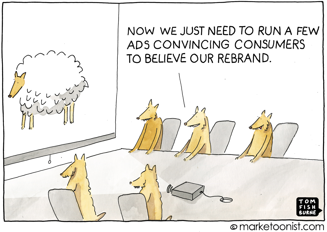
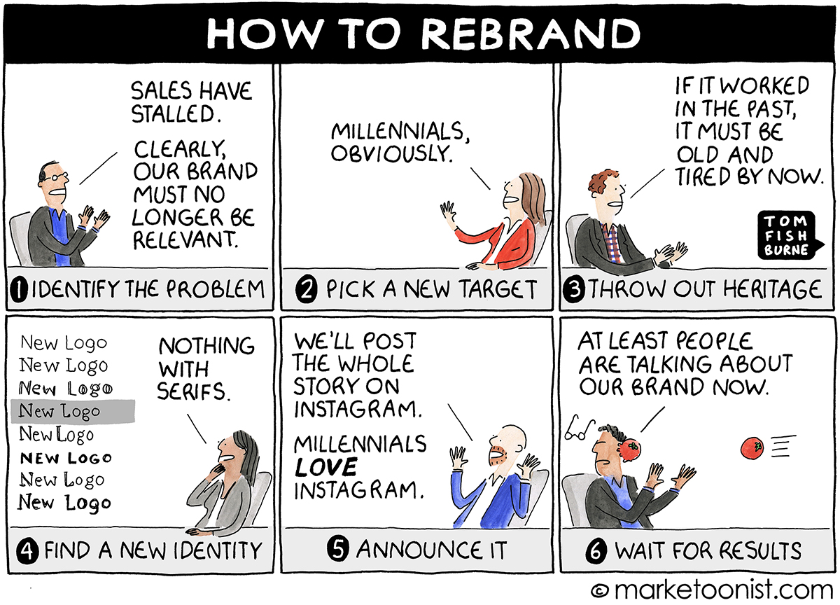
Here are a few related cartoons I’ve drawn over the years:
“Rebranding” May 2016
“Rebranding” September 2014