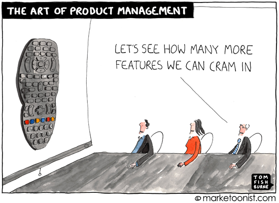
There’s always room for one more feature. Feature creep is the ongoing addition of new features, over-complicating the original idea. It often comes from committees making compromises.
At Square, Jack Dorsey’s payment company, they call their product managers “Product Editors”. Deciding what not to put into a product is more important than deciding what to put in.
I stumbled across Andrew Chen’s article on Square and the product editorial model. He shared these insights:
“Bad ideas are often good ideas that don’t fit. In the context of literature, books, and newspapers, it’s the job of the editor to pick the good stuff and weave it into a coherent story. You remove the bad stuff, but ‘bad’ can mean it’s a good idea but just doesn’t fit into the story…
“You don’t just jam lots of characters and plot points in a story just because. Even if they are good characters, it can bloat the story. Same with features- sometimes you have many, many good ideas for your product, but if you come to do all of them, you ultimately make it a confusing mess. Instead, you have to “edit” down the feature list until you have a clean, tight experience.”
Here’s a video of Jack Dorsey talking about the concept of editing as it relates to his job as CEO of Square:
The editorial model applies to any type of product management, not just consumer internet. Great marketing requires great editing.
(Marketoonist Monday: I’m giving away one signed print of this week’s cartoon. Just share an insightful comment to this week’s post by 5:00 PST on Monday. I’ll pick one comment. Thanks!)


denise lee yohn says
this reminds me of what someone told me is the “lycra principle”: just because you can doesn’t mean you should 🙂 — denise lee yohn
Steven Haines says
Great cartoon!
In the video: Great people working toward a single goal. What a concept!
Steven Haines
Author: The Product Manager’s Desk Reference
Boris says
I love this example. I wonder if there is someone on this planet who knows every function his remote is able to do.
Rob Cottingham says
While we left TiVo behind a few years ago – digital downloads now account for nearly all of our TV watching – one thing that blew me away from the beginning was just how simple both the hardware and software interface were, compared to what we’d seen from the cable company. If only your remote really were an exaggeration!
Bill Carlson says
Before I marketed and sold products, I was involved in designing and developing them and this pushes buttons from those days…
My world was technology-based products with embedded software and for many clients, every new idea was SMOP — “small matter of programming”.
And it was generally accurate, which made it all too easy to just keep adding features and functions.
But I’m not going to argue it’s wrong to add them — just suggesting that we appreciate the “law of diminishing usage” which states that once you’re past the core functions (like changing channels, adjusting volume and recording shows), adding more is not necessarily wrong, but you shouldn’t let features which are less likely to be used get in the way of the primary and most common usage.
We put some effort into studying consumers/users of products but tend to nervously mistrust those findings “just in case…” I don’t really object to having the extra features/functions, but need to think of users in terms of tiers — the basics should be easy-easy while offering a way to satisfy more sophisticated/confident users.
Karl Sakas says
Thanks for sharing Andrew Chen’s article about “Product Editors” and bad ideas often being good ideas that don’t fit! There’s the oft-repeated advice to writers about self-editing: “If you think the sentence you wrote is really clever, you should probably delete it.
The Apple TV remote is a simple, effective work of design genius. Just four buttons (play/pause, menu, select, and the up/down/left/right toggle) in a brushed aluminum package that looks tiny next to my TV and DVD remotes… yet it easily controls a vast library of Netflix, iTunes, and other content. Of course, it works because the on-screen user interface handles things like the occasional “keyboard” for typing.
When my agency builds websites for clients, most sites now have designs with “meganavs” or “mega menus,” a mixture of text and graphics that makes it easier for site users to find things — much easier than old-style text-only drop-down menus. UX expert Jakob Nielsen talks more about that here, including how to avoid going overboard: http://www.useit.com/alertbox/mega-dropdown-menus.html
Janice Francisco says
Hi Tom
I love the concept of product editors. In my work, I am often involved in leading instructional design projects – we produce training products. A constant challenge is balancing what subject matter experts (SMEs) think is important (let’s cram in one more piece of content) and what novice learners really need to know. When I saw this week’s cartoon I immediately was reminded about how similar it was to what I experience. Thanks. Now I have a funny way to explain to SMEs why we don’t need to add another feature.
Susan says
Some call it “curating.” Hiding away even great things because humans can only process so much.
DSprogis says
When the Product Manager is the CEO s/he can also be the Product Editor. When you’re not in charge, you’ve got a much tougher time saying “no” to stakeholders or pushing feature that don’t fit deeper into the backlog.
Russell says
What strikes me as missing in this analogy is that to be an effective editor you need to have a complete and clear vision and a lot of authority. I have a suspicion that this is more relevant in a B2C world rather than B2B.
In B2B most product development take place in an environment of specific customer input and feedback and or validation. (Because for B2B to work you have to be solving a problem rather than trying to influence a preference). And saying “No” to a paying (or potential) customer is very hard.
What is most interesting about Square is that it is indeed a B2B offering. The user facing part of their offering has Apple like elegance and simplicity.
As they evolve and expand and start to feel the pressure for additional capability (especially in their back-end) it will be interesting if they can maintain this disciple of the editorial approach.
Jon says
Sadly, there’s really not that much exaggeration in the cartoon, if you judge by a Samsung remote I actually own: http://www.amazon.com/Samsung-Remote-Control-LN-Series/dp/B001COKRB0/ref=sr_1_2?ie=UTF8&qid=1344959017&sr=8-2&keywords=samsung+remote+control
or this one from Logitech: http://www.bestbuy.com/site/Logitech+-+Harmony+300+-+4+Device+Universal+Remote/9939314.p?id=1218197820724&skuId=9939314
It’s scary when reality encroaches upon the comedic absurd.
Bshan says
I have always noticed that there is a natural tendency for Product Managers to lean towards the CYA (cover-your-a..) model where it feels like a safe bet to include as many of your stakeholder’s requirements as possible (after all, has a Product Manager ever been blamed for delivering too many features!) However, a mature and experienced Product Manager will realize the importance of deciding what features to drop and when it is the right time to possibly kill or deprecate products and features.
tomfishburne says
Hi all,
Many thanks for the great commentary this week. This week’s cartoon print winner is Russell. I’m intrigued by the point on the distinction between B2B and B2C when selecting features and benefits, and juggling direct specific customer input with the need to keep it simple. It will be interesting to see how Square continues to evolve with those inputs (including the recent announcement that Starbucks will start using Square).
-Tom