This is in the vein of my “How to Write a PowerPoint Pitch” cartoon a couple weeks ago.
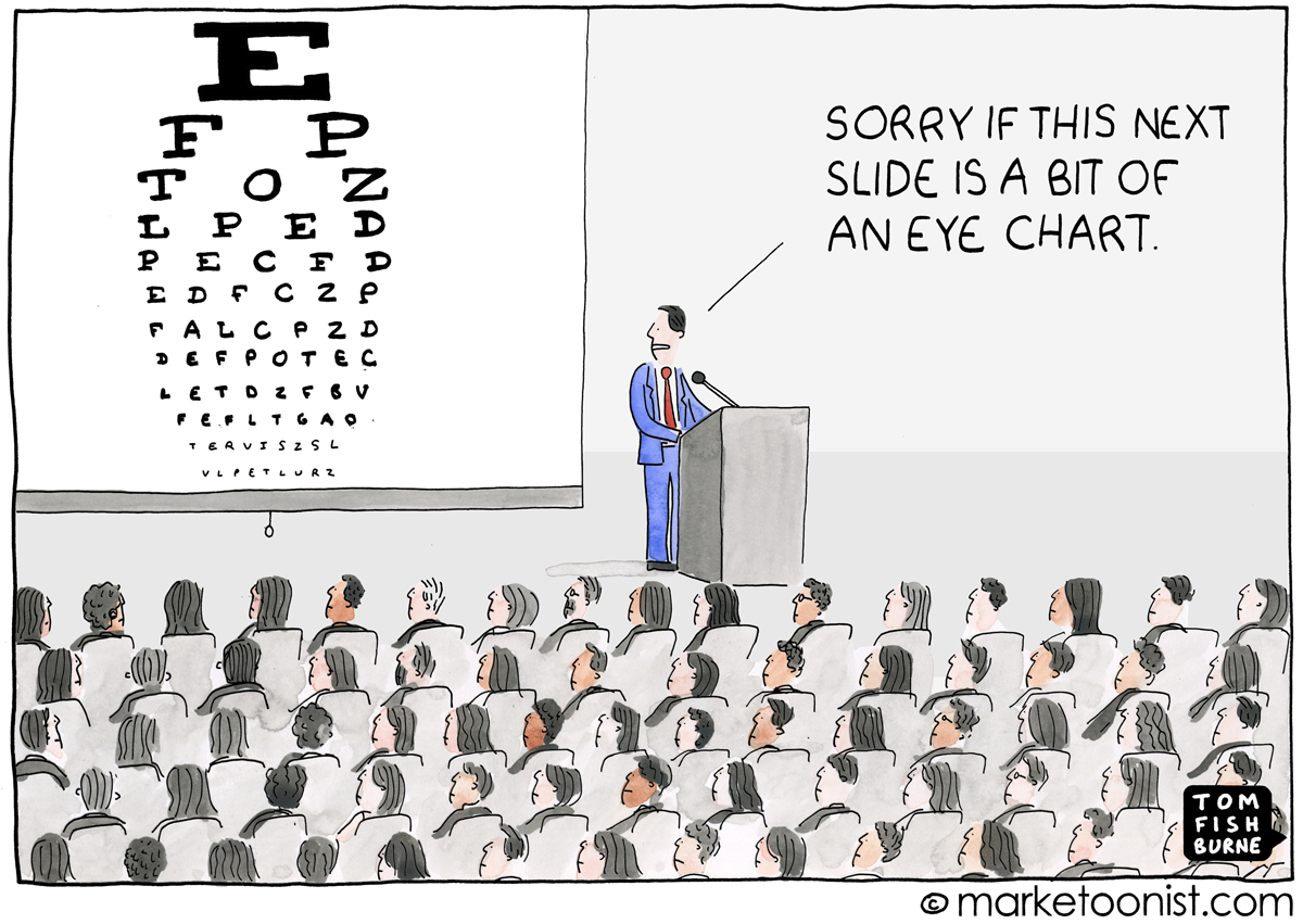
Presenters often apologetically refer to overly busy slides in their presentations as “eye charts”. If you ever feel compelled on-stage to apologize for showing an “eye chart”, that’s a good sign you might want to rethink your slides.
When I started my marketing career, we were trained to create “slideuments.” Half-slide, half-document, the resulting pitch decks were intended both to project in meetings and circulate separately for review. We were often restricted to a certain number of slides, but were were required to pack in a certain amount of information. So, the resulting slideuments were dense and lifeless. And full of eye charts.
Presentation Zen author Garr Reynolds describes slideuments as “the illegitimate offspring of a projected slide and a written document”. He compared them to the proverb of trying to chase two rabbits and catching neither.
“Slideuments” persist as a communication method everywhere. Companies create slideument templates, conferences request leave-behind slides to share with attendees, and many presentation slides get uploaded straight to Slideshare.
Yet the reading audience is fundamentally different from the presentation audience. The information best shared in a leave-behind is fundamentally different from the information best shared in a live presentation. If your idea is worth presenting live, it’s worth investing the time to create visual aids to put your idea in its best light.
Giving a live presentation of slideuments and eye charts is the quickest way to lose your audience.
In addition to “How to Write a PowerPoint Pitch”, here are a few related cartoons I’ve drawn over the years:
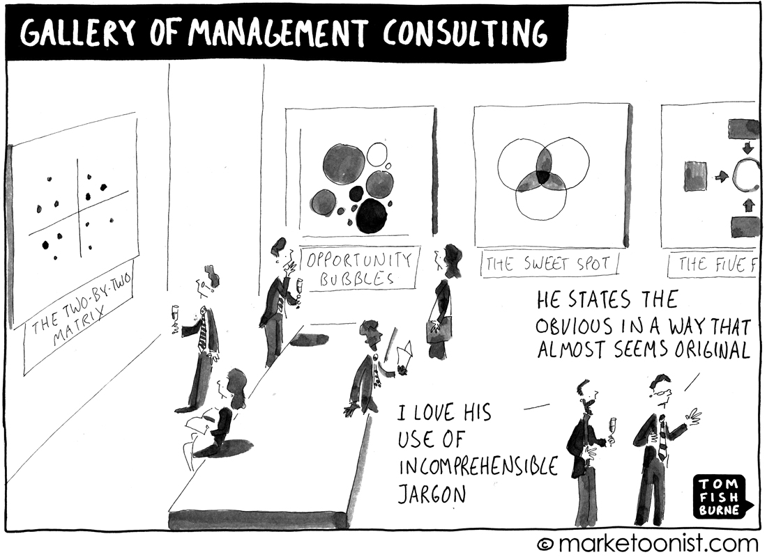
“Gallery of Management Consulting” February 2009
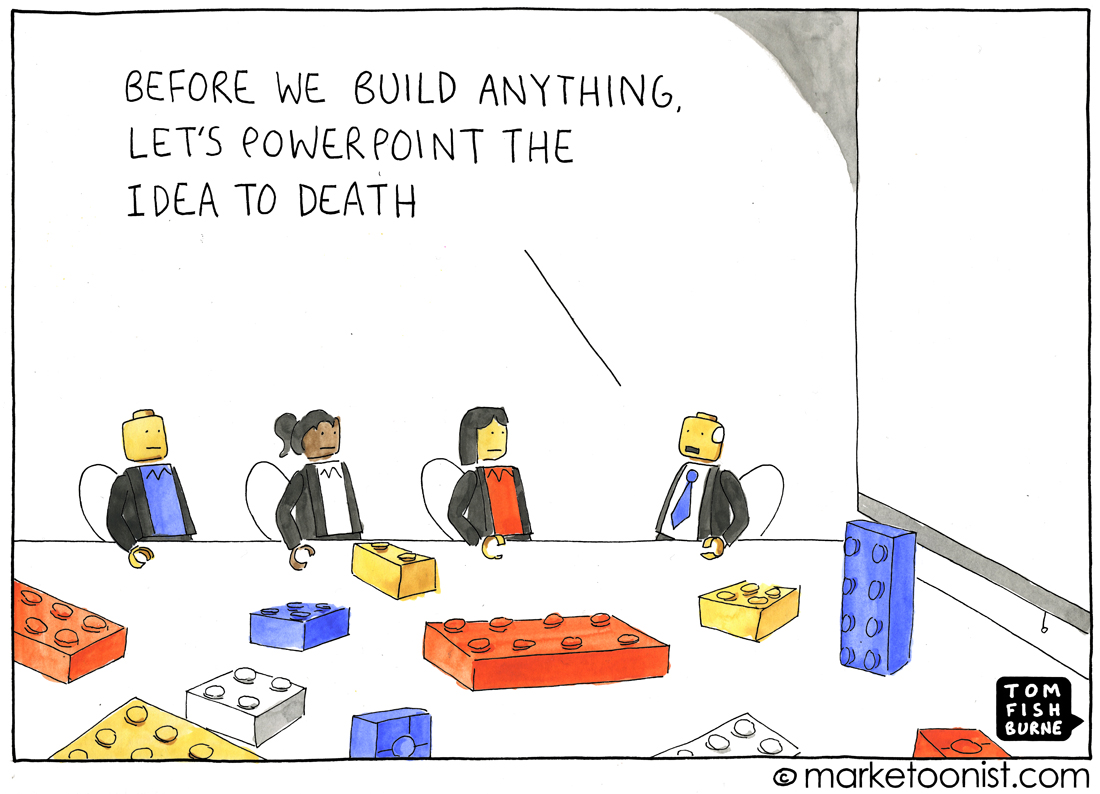
“PowerPoint the Idea” March 2012
Bob Hatcher says
Earlier in my career at a high end management consulting company we were taught that your slide deck had to be comprehensive enough to stand on its own. Slide decks frequently would get passed along by attendees to others who were not at the meeting and it had to make sense to them. Accomplishing that goal all while keeping it simple and entertaining was a real challenge.
Michael Hay says
Thanks Tom – love your work. Its interesting to me that the culture of slide decks has persisted so long in Ontario government. Despite knowing that slides cluttered with text are ineffective ways of communicating, there popularity and acceptance continues. Often times content developers are given a slide limit (which exacerbates the problem of putting to much on each slide). BTW – I am a huge fan of Garr’s books. Prezentation Zen was a game changer for me.
Paul (from Idea Sandbox) says
The problem is we are combining different tools into one thing… making neither effective. One is the presentation. One is the information deck.
A PRESENTATION should simply be background and key visuals to make your point. You do the work, not the slides. They support you. (Steve Jobs was a master at this. TED Talk presenters mostly use this approach. And… both Jobs and TED Talk folks are considered highly effective in getting their points across).
The INFORMATION deck may be the one chock full of information – broken into slides, but is not meant to be “presented.” This is the piece that can stand alone, be passed around, and make your point.
One of the benefits of slides is you get to break your content into progressive chunks… moving the reader bit by bit without showing too much or allowing them to skip ahead (as you could do with a long document).
I attribute the problem with eye charts to our being lazy or just not caring enough to pay attention to the detail. “Too busy” is not a good excuse. Too busy to do your job is a bad sign… Finally, I blame the boss who allows an eye chart to be presented. It makes your personal brand look bad as well as the brand of your team look bad.
Ralph Pagan says
Great, and so true!!!
Andrew Ziem says
Good article to get people to think about the purpose of slides.
In case anyone else is wondering what an “eye chart” is, it is a presentation slide so dense with text, that the text must become small and therefore difficult to read. The people in the audience feel like they are having an eye exam.
(I had to Google this.)