Working at method has taught me that package design is the single most important part of your marketing plan. Founder Eric Ryan likes to say that he views cutting steel as a marketing expense. Once a consumer told me that he buys method because the package design makes him want to lick the bottles.
Remarkable design, whether in the store or in the consumer’s hand, makes every other aspect of marketing possible. Zero advertising on a remarkable product trumps heavy advertising on a mediocre product.
Remarkable design implies that it’s fundamentally different from what is already on the shelf. That’s what makes it worthy of remark. It is that fundamental difference that allows a brand to break through the clutter.
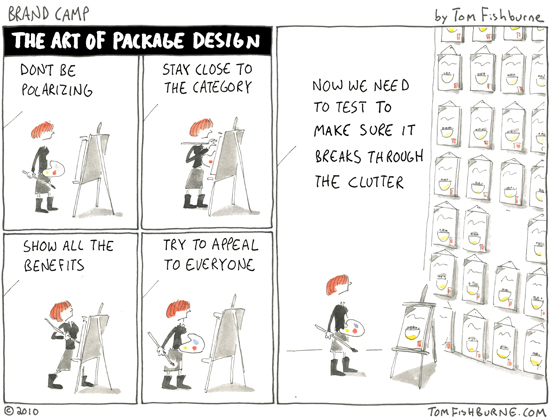
Yet there is reluctance to be different. In every design project I’ve witnessed, there has been a headwind that pressures the project to what has been done before. When that headwind blows from client to agency, it’s particularly hard to resist. Sometimes this headwind is created by the conventional rules of the category. Sometimes it’s a fear of alienating consumers. But the headwind, if not countered, restrains design to the path of least resistance.
The result is that the vast majority of products launched every year are not that different from what’s been launched before.
Seth Godin recently critiqued the package design of an African chocolate brand called Madecasse. Madecasse has a remarkable story (it’s the only imported chocolate brand made in Africa with local beans), but the package design looks no different than the myriad of high-end chocolate brands already on the market. The brand’s non-remarkable packaging actually camouflages the brand’s remarkable story.
The best cure I’ve found is to be stimulated by package design that tries something different. Dennis Thompson at Thompson Design Group sends out emails to all current and former clients several times a week with examples of provocative design he stumbles across.
If you don’t know Dennis, read The Dieline. Have everyone on your team (no matter what role they play) discuss those examples regularly. Instead of benchmarking off of what’s been done before, try to be inspired by package design that dares to be different.


Andrew says
That’s one of those pet peeve areas of mine that is even worse on a package redesign. Not only are you constrained by the category and its norms, but you also have to deal with the history and heritage of the brand. I remember a discussion of design concepts once where the team was discussing a “revolutionary” (vs evolutionary) option. It was supposedly so much of a dramatic departure that there were fears consumers wouldn’t recognize the brand anymore. Having joined the meeting a few minutes late, it took me about 45 minutes to realize that the board I was looking at was that design and not current. Of course I’d only been on the brand team for two years…
Steve Fair says
Brilliant post – we non-design people enjoy having the issues you face brought to life. Thanks!
Michaela Mora says
This post is right on the money, but I would argue that it is a good thing that marketers be challenged to find the right balance between new packaging designs and brand equity. We all saw what happened to Tropicana and Gatorade last year. I think we can’t escape the effects of brain plasticity. If you want to know what I mean, check out this post: “Why New Packaging Fails to Drive Sales and How to Avoid it” (http://www.relevantinsights.com/new-packaging. BTW, I love your cartoons!
Mick Burchfield says
I laughed out loud when I read this cartoon. I think so many of us marketers/branders/designers can sympathize with it. I think Michaela makes a fair point and I would add that it is important to understand the brand involved. A market leading brand with high recognition can often do more harm than good with a big packaging departure but new brands have a unique opportunity to develop their visual identity outside of these constraints. I find that big corporations often undermine the process by nature of “too many cooks” and too many requirements as the cartoon suggests. The most innovative and often compelling packaging frequently comes from smaller upstart brands – ones like Method or Red Bull.
Big fan of the blog and cartoons, Tom.
Daniel Barcelo says
There are so many tensions that arise when creating package design. There’s the category, the brand history, the audience, and the direction the brand is heading, not to mention trying to stand out! there are just so many thing to consider.