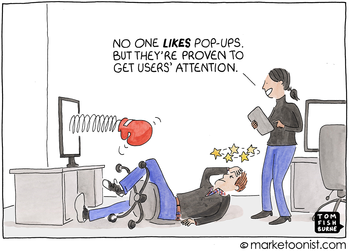
The web has turned into an obstacle course of pop-ups upon pop-ups. No one likes pop-ups and yet there’s plenty of conversion data that designers can point at to justify them.
That’s the pop-up conundrum. There’s data to show people find them annoying and there’s data to show they work. Pop-ups have become standard design practice, and yet I still find it strange that standard design practice would accept design that is “annoying but effective.”
I think we have to be careful with the “annoying but effective” justification. The numbers sometimes ignore hidden costs like lower engagement. And there’s a slippery slope to using numbers to justify dodgy behavior like making it hard to cancel a service or hiding “unsubscribe” links.
At the extreme case, this justification can lead to more sinister “dark patterns” — “features of interface design crafted to trick users into doing things they might not want to do, but which benefit the business in question.”

I like this perspective from UX designer Luca Benazzi, who argues that “enough is enough”:
“Design should not be driven by impersonal, aseptic statistics, when well-founded best practices and simple common sense lead in the opposite direction…
“First and foremost, design should be friendly to humans, and design decisions should be based on what we already know about them. We have plenty of evidence-based research data on what people like, and what they find intuitive and helpful. We also know what they find annoying, time-consuming, and unnecessarily distracting…
“The statistics showing an increase in conversion don’t take into account the hidden costs. And even if begging for the user’s attention was supported by numbers, it would still be against common sense, and respect that we owe to other people. We can’t all ignore what an appropriate behaviour is, and turn into ill-mannered content creators, just because the numbers say that it’s OK to do so.”
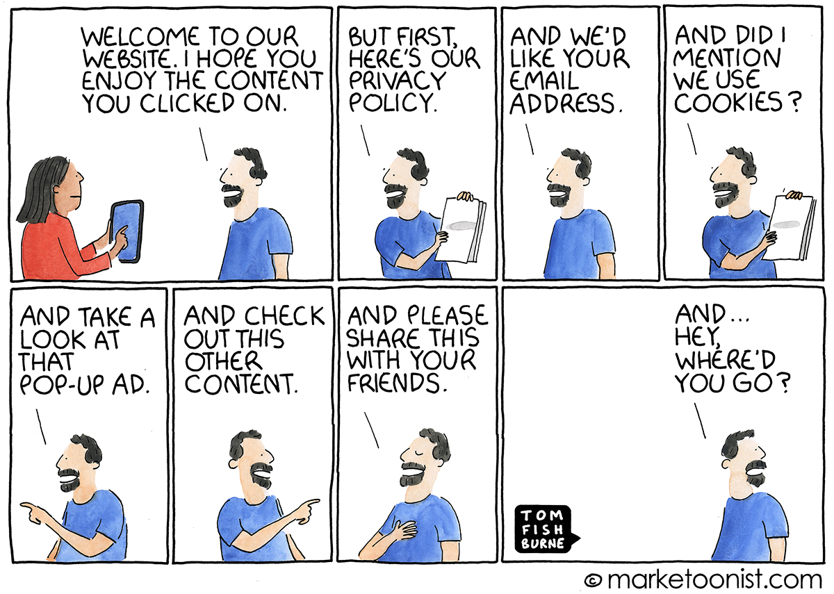
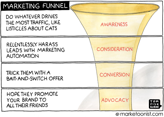
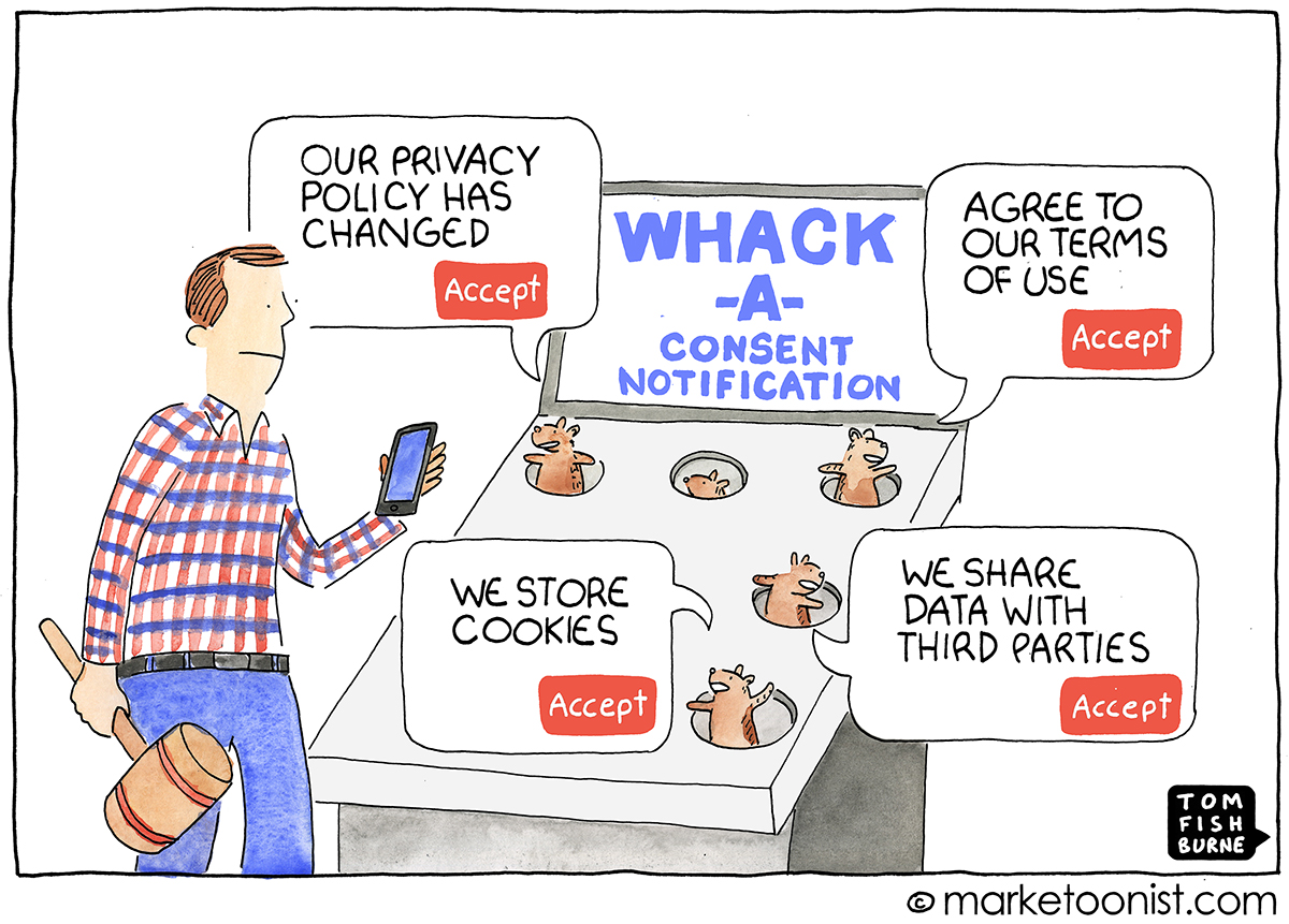
Here are a few related cartoons I’ve drawn over the years: