Instagram caught a lot of flak for its rebranding last week, but it’s only the most recent in a string of companies that have gone through brand makeovers. Uber, Airbnb, and Yahoo each debuted new brand identities in the last couple years that were widely lampooned.
The biggest rebranding cautionary tales remain Tropicana in 2009, which backtracked after sales dropped by 20%, and Gap in 2010, which reverted to its old logo after just 6 days of criticism.
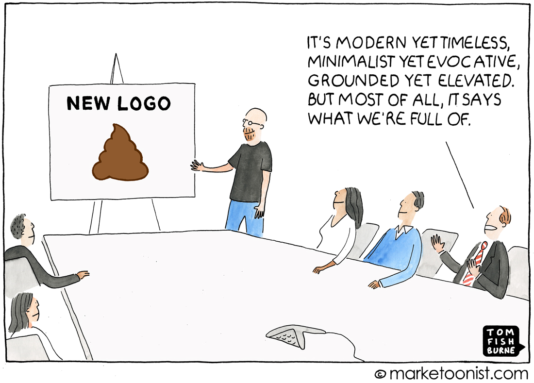
What cracks me up the most about rebranding efforts is the self-indulgent way that brand teams can articulate what went into them. They often put together overly intellectual and ridiculously complex justifications for even minor elements of a brand redesign. They get swept away by their own hyperbole.
My favorite example of a brand “waxing poetic” to introduce a new identity is Uber and their “Bits and Atoms” manifesto.
“For Uber, the bit represents our technology. It’s complex, precise, and advanced. But when it’s expressed, it’s effortless and refined…
“And if you think the bit is a big deal, consider the atom. Born 13.8 billion years ago, the atom is responsible for everything. From the BLT … to moms everywhere … to New York City. And for us, the atom signifies our rapidly improving cities, the goods we move from place to place, and most important, the people we serve…
“Until a few short years ago, atoms and bits existed in entirely different worlds. But then, something happened.
“What if we brought these two worlds together?
“What would that look like?”
Apparently, what it it looks like is this.
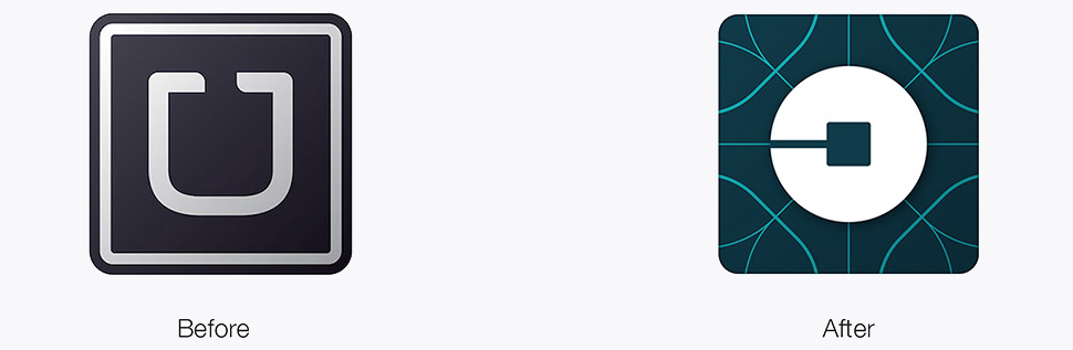
Uber CEO Travis Kalanick described the logotype as “at once more grounded and elevated.” Whatever that means.
Rebranding efforts sometimes read like “The Emperor’s New Clothes.” The brand team rhapsodizes about all that went into it, without seeming to realize when it misses the basics.
I’d love to hear your thoughts on what to keep in mind when considering a rebranding exercise.
Here’s another cartoon I drew on rebranding a couple years ago.
John Dodds says
First question to be answered. Have we changed sufficiently for a rebranding to be justified or are we just re-logoing?
BC says
If you have to explain a logo, it’s a fail.
If you feel the need to explain a logo, it’s a bigger fail.
So, probably best to not explain it at all.
Nike’s “swoosh” gets meaning from promoting the brand. Googling reveals a connection to Greek mythology, which is all well and fine if you choose to dig for it. But lots and lots of $ have successfully connected the mark to the brand without most of us ever knowing the backstory — including me until I just looked it up…
Changing a brand mark is just begging for differences of opinion. In the end, any change to a brand’s visual i.d. is going to bring out supporters and detractors — it’s a subjective thing. Interestingly, I didn’t really care at all about Instagram’s logo until they changed it.
And for the record, I didn’t get it.
Which was fine until they felt compelled to react to reactions.
Which loops back to the first 2 sentences in this post… 😉
Barbara says
Once again, Tom, you’ve hit it the nail on the head. I do believe clients — and their agencies — get swept away by their own hyperbole. I have worked for Gannett Co. for many years and was dumbfounded when USA Today unveiled their new logo: a plain blue circle. I would love to have been in that room as the agency was selling that one. I also shutter to think what Gannett paid to have it created. Personally, I think it says nothing or does anything for the brand.
Luka says
The logo arouses strong feelings and means so much to so many people … and yet, at the end of the day, it’s often better to have a recognisable if boring and imperfect logo, than a revamped and completely different logo (e.g. Uber, EY).
Instagram’s new logo is, in my opinion, a step back. However, it stays recognisably in the same visual space and metaphor, and it might be a case of “there’s no such thing as bad publicity.”
The Better Breads Baker says
Agree with you! Re-doing a logo without Re-thinking Brand Shift/Perception is an unnecessary exercise!
Susan Goewey says
Uber’s “before” wins by a mile! In Consumer Behavior class (UVA, 1980) or it might’ve been in Marketing class (where I had this fabulous text by Leonard Barry called Marketing Mistakes.)
I remember being taught that company executives/boards get tired of their ad campaigns/logos/slogans long, long, long before consumers do. And changing them too soon and/or too often is a huge, but common, marketing mistake.
I think that is still true. Consumers want comfort not change. A great jingle is a great jingle. A good logo is comforting. A new logo is confusing. That’s why it’s so important to get it right the first time and then just stick with it.
PS Tom if you’re still giving away a free print to a commentor…this is NOT a picture I’d like to win or see hanging on my wall… Not even (especially even) my bathroom wall! I hope you understand 🙂
Allen Roberts says
Straight to the heart of bullshit central!
As usual.
Well done Tom.
Ram says
Really interesting…was reminded of a “creative presentation” where the presenter was waxing eloquent about the “dot” over the “i” in the brand logo, and how that was supposed to mean something.
And in these meetings, you actually sit there going, “am i the only one who does not get it?”
The Better Breads Baker says
LOL! It’s an era where truly i matters more than I
Tina Li says
We have a China player Didi Taxi that did the same thing last year. For two weeks I could not find it on my mobile and I thought that I accidentally deleted from my phone. This kind of rebranding is a completely waste of time and effort! It is damaging the brand ! Only small group of users complain about it. Majority of other people completely ignored or missed the brand among the many other choices and turn to alternative offer in the market.
Doug says
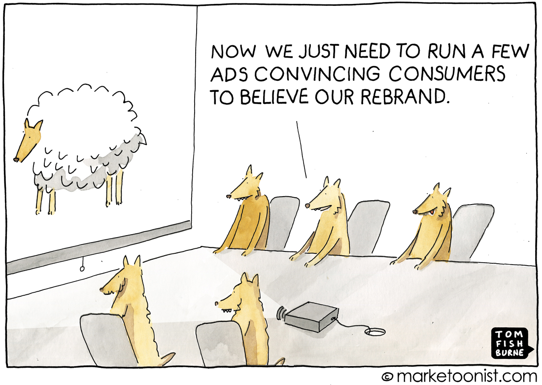
This gets to one of my biggest pet peeves in the marketing industry – the use of the term “rebrand”. We can’t “repersonality” ourselves and it’s no different for companies. Sure, a logo is part of a brand but it’s not the whole. Much like the wolf in sheep’s clothing cartoon, and as we who read Tom know, a brand is slow to develop, change and adjust. A logo won’t magically alter that perception, despite what I feel many companies believe, thus my frustration with rebrand. Great cartoon, as always!
Michaela says
This is a great cartoon, which inspired me to write a blogpost about a rebranding exercise I was involved with at Blockbuster Online, which was a good example of how this should be done. You can read the blogpost here: http://www.relevantinsights.com/how-to-avoid-rebranding-mistakes
Thanks Tom!
RSF says
“…missed the basics” that sums it up with most brand refreshes.
I had trouble locating the Uber app on my phone for days because I could not recognise the app logo.
Was I happy? NO!!!
Besides, what EVER was wrong with the ‘U’ …
What does the power-on symbol imply?
Soooo many questions…so much gibberish
Michael Zimmerman says
Artists and art critics sometimes refer to it as “the intentional fallacy.” Simply put, “if you have to explain it, it isn’t.” The artist’s intent is irrelevant, except to himself. Art must stand on its own. That said, I fully concur with Doug’s comment that we can’t re-personality ourselves without a great deal of effort and time. Rebranding is a process involving the entire organization – just like marketing.
Daniel Nobre says
Not wanting to be the Devil’s Advocate here (most branding presentations are indeed full of crap intended to make a brand’s conceptual background more abstract and intelectual than it is needed) but I do need to say that although people tend to not be receptive to change and although branding agencies bullsh*t a lot that doesn’t mean change is outright bad. Most of the problem comes from having a 60s Mad Men approach, based on the old school concepts of the ‘creative’ genious that leads a team to a glorious sign off that pays the bills for years to come. This is only good for the agency but bad for the client and it’s customers. Not because branding is not needed, but because they want to make it sound revolutionary and explosive to clients since they are only worried about sign off. But the truth is a) branding is an area that can rely on data, just like almost everything else and b) it should have a plan for gradual implementation due to ‘user adoption cycles’ for gradually transforming the old logo into a logo that fits the current strategy and finally c) change it ONLY if there is a real need i.e. to reflect a change in the company – it needs to be consistent and a multichannel experience since just changing your branding means anything if not coupled with consistent improvements in other sides of the company.